

Lorem ipsum dolor sit amet, consectetur adipiscing elit, sed do eiusmod tempor incididunt ut labore et dolore magna aliqua. Quis viverra nibh cras...
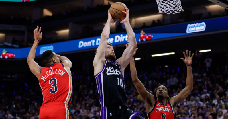
Kings vs. Pelicans Play-In Preview & Predictions: It all comes down to this
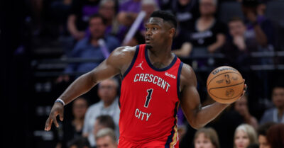
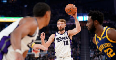
The Kings have earned a final shot at the Playoffs, but they'll have to beat the team that has given them the most trouble this season to do so.