Lorem ipsum dolor sit amet, consectetur adipiscing elit, sed do eiusmod tempor incididunt ut labore et dolore magna aliqua. Quis viverra nibh cras...
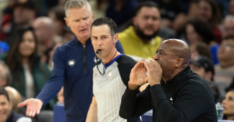
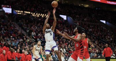
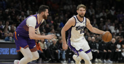
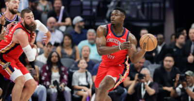
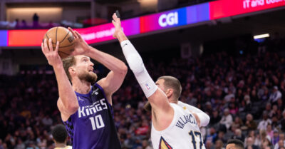
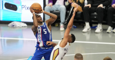
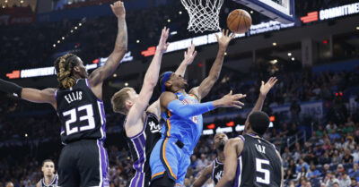
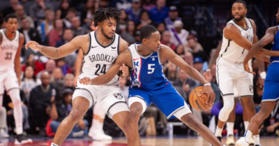
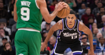
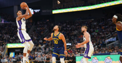
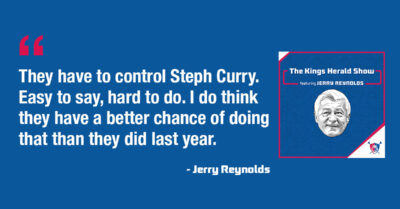
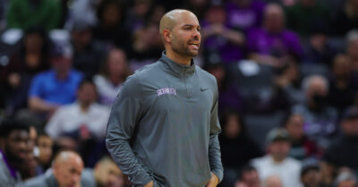
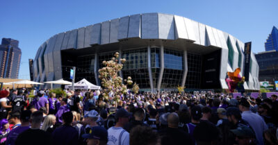
Mike Brown, Steve Kerr share thoughts on Kings-Warriors Play-In matchup
A rematch, sort of, is going down tonight at Golden 1 Center. Both coaches talk about it.