Lorem ipsum dolor sit amet, consectetur adipiscing elit, sed do eiusmod tempor incididunt ut labore et dolore magna aliqua. Quis viverra nibh cras...
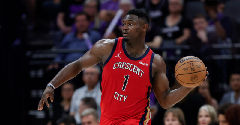
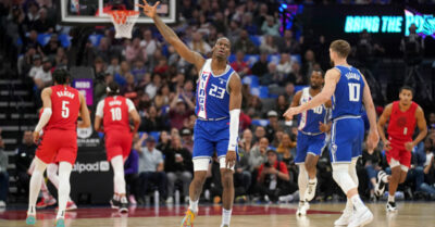
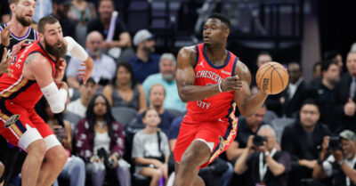
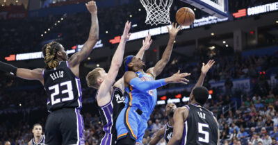
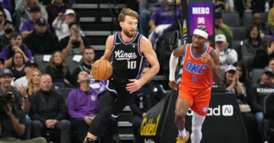
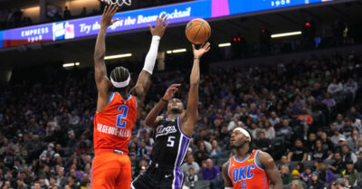
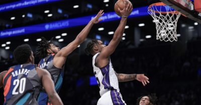
Zion Williamson ruled out against Kings, per Woj
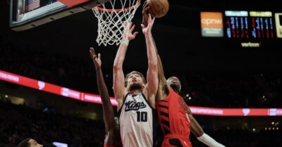
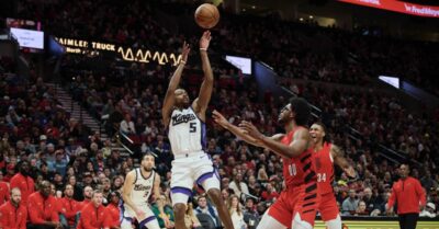
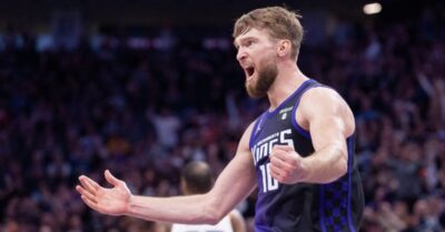
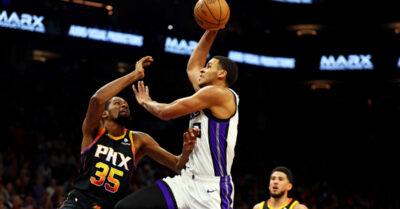
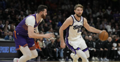
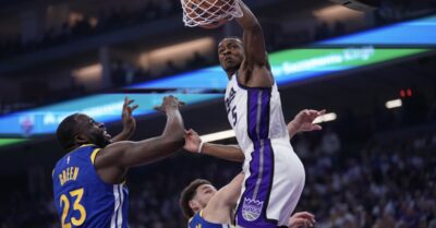
A big blow for the Pelicans, and a big opportunity for the Kings.